Moodfit App Redesign
Fitness for your mental health
Summary
Moodfit is a mental assistance app that helps users reduce their anxiety, depression, and high levels of stress by “shaping” their moods.
Moodfit provides multiple different customization tools to help the user understand their behavior and moods. User can achieve their daily goals by participating in activities to create a better mood.
It can be a bit daunting when a first-time user doesn’t know what tools to use for their mental health. I understand that the mind is very powerful and I want to make sure the user knows what tools are available to them.
-
My Role
UX Design
UX Research
UI Design
-
Project Duration
4 months
-
Tools
Figma
Marvel
Usability Hub
Powerpoint
Reason for the Redesign
Difficult to locate necessary information about the features of the app
Content overload on the main home screen
Little to no education on how to better the user’s mood and mental health
No onboarding process to welcome and guide the user
No daily check-ins are available to help the user become more self-aware of their mood and emotions

Project Goals
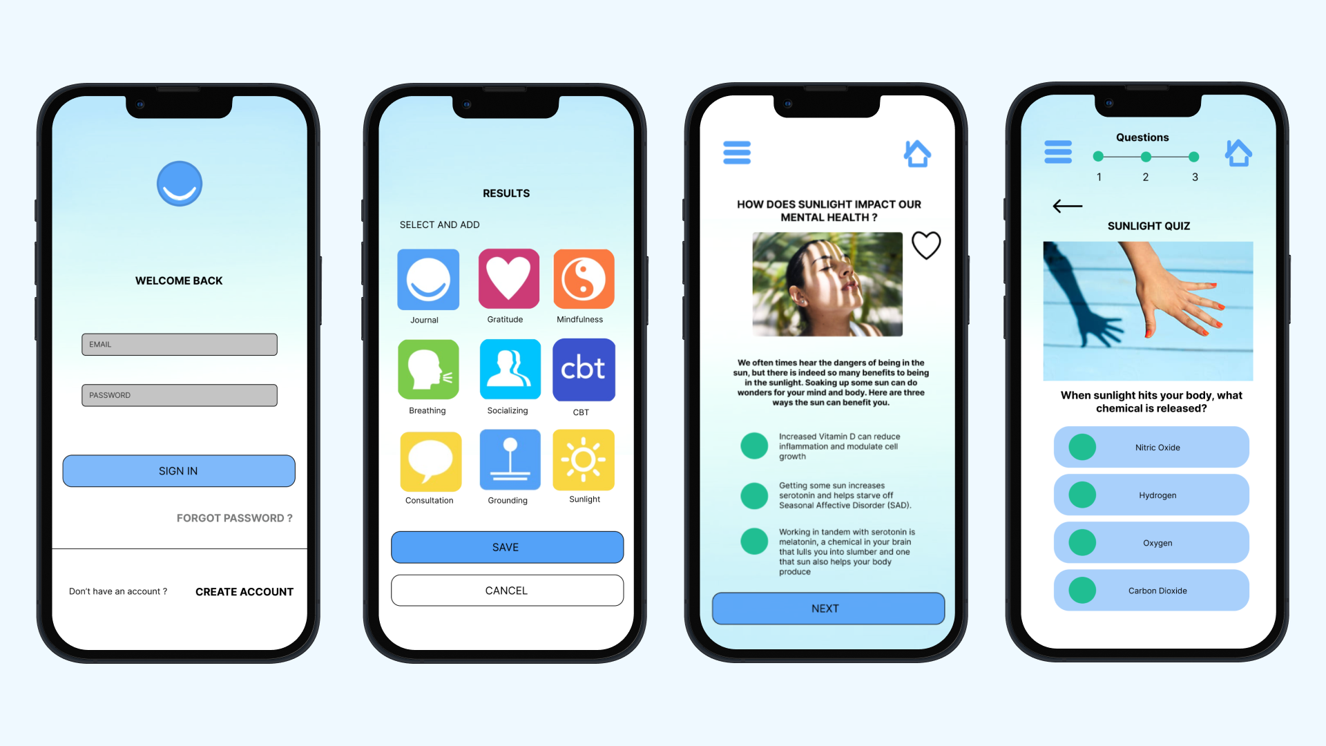
Design to educate users
Understanding the infinite knowledge of mental health can be overwhelming. Designing lessons and educating the user will help them become more intrigued about how they can reduce their anxiety.
Design to monitor user’s emotions
Providing a comprehensive set of customizable tools will help the user learn and focus on what most affects their mood. Awareness plus data and reporting done regularly is how to track and create a better mood.
Research Methods
-
User Stories
App features written from the perspective of the end user or customer
-
User Flows/ Customer Journeys
Constructed the path taken by a prototypical user on the Moodfit App to complete a task
-
Prototype Testing
Gathered feedback from the target audience on what works and what doesn't
-
Preference Testing (A/B Tests)
Conducted research testing with participants by having them choose between 2-3 design variations and explaining their preference. Preference testing is used to understand users' brand perception and visual preferences.
User Stories
Features that user’s are looking for in the Moodfit App
1) As a user, I would like to be better educated about the app through the on-boarding process, so it’s easier for the me to customize the widget tools
2) As a user, I should be well aware how to complete the daily goals/ checklist and how to add or subtract the tool widgets
3) As a user, I would like to be able to track my mood better by adding more information on how I feel on a daily. Being able to track my mood will help me become self-aware
4) As a user, I would like to be able to be motivated to continue working on my mental health, I’d like to be better educated so I can learn to tame my mind
User Flow
After understanding the user stories, I need to capture the customer journey. It’s important for me to understand the path of the user. It's integral opportunity to see how the user completes a task within the Moodfit App
Key Takeaways
Many of the participants really liked the color palette and felt welcomed on the main homepage
Participants were easily able to access the daily check in’s and add information about their moods and emotions
Many wanted a transition screen from the daily check-in to the body scan screen, and many users wanted a skip button
In my initial prototype, “Daily Check-In” did not make sense to the participants, so I needed to change the verbiage to an action “Daily Mood Check In”
Prototype Testing
Interviews allow me to speak with individuals, get a glance at how the users will interact with the Moodfit App every day
Preference Testing
Prior to the development of the app, it’s important for me to conduct tests, identify problems and make necessary adjustments to meet the user’s wants and needs. I conducted A/B Preference Testing where participants are presented with the home screen and the customization screen.
Design Collaboration
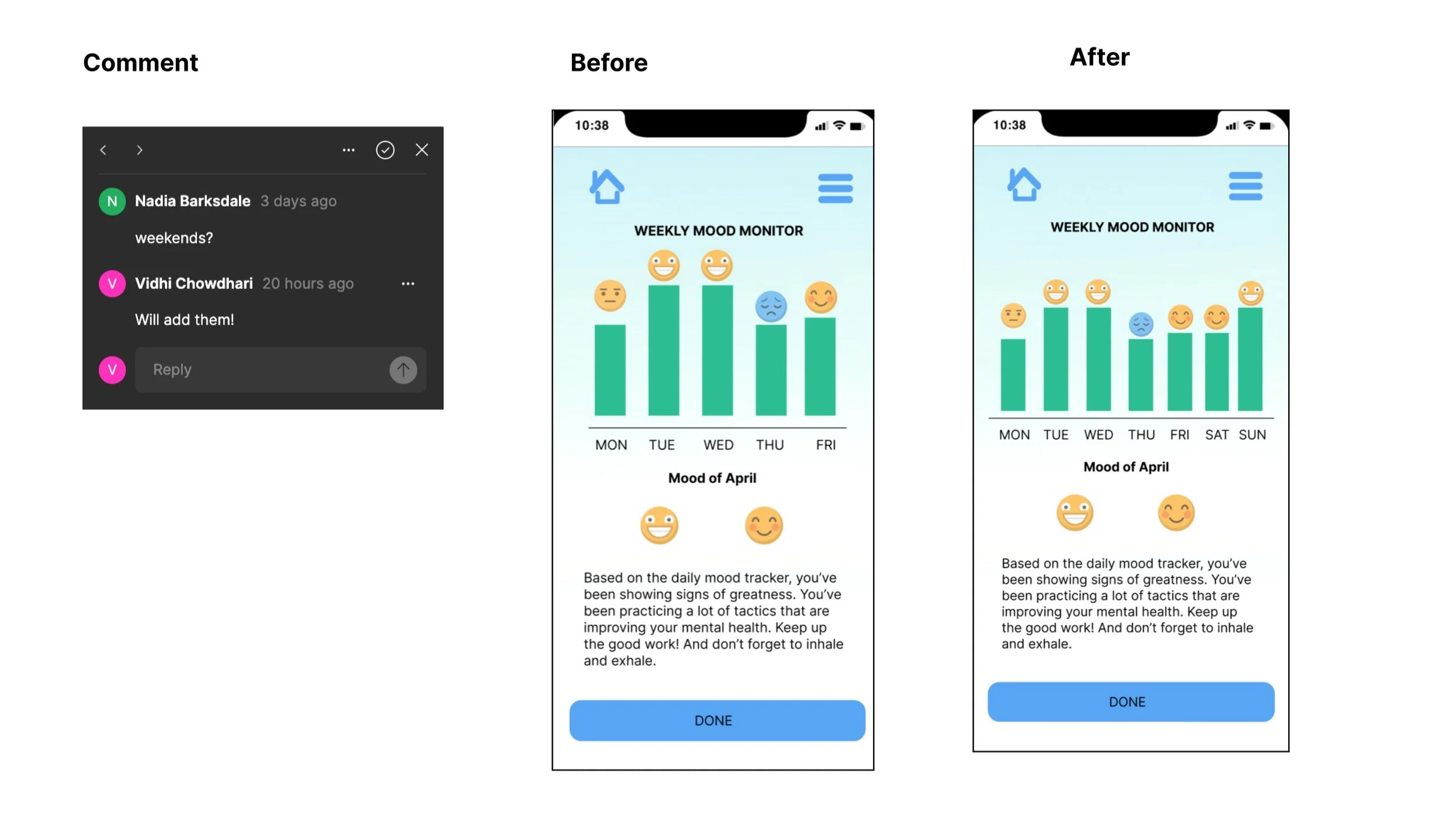
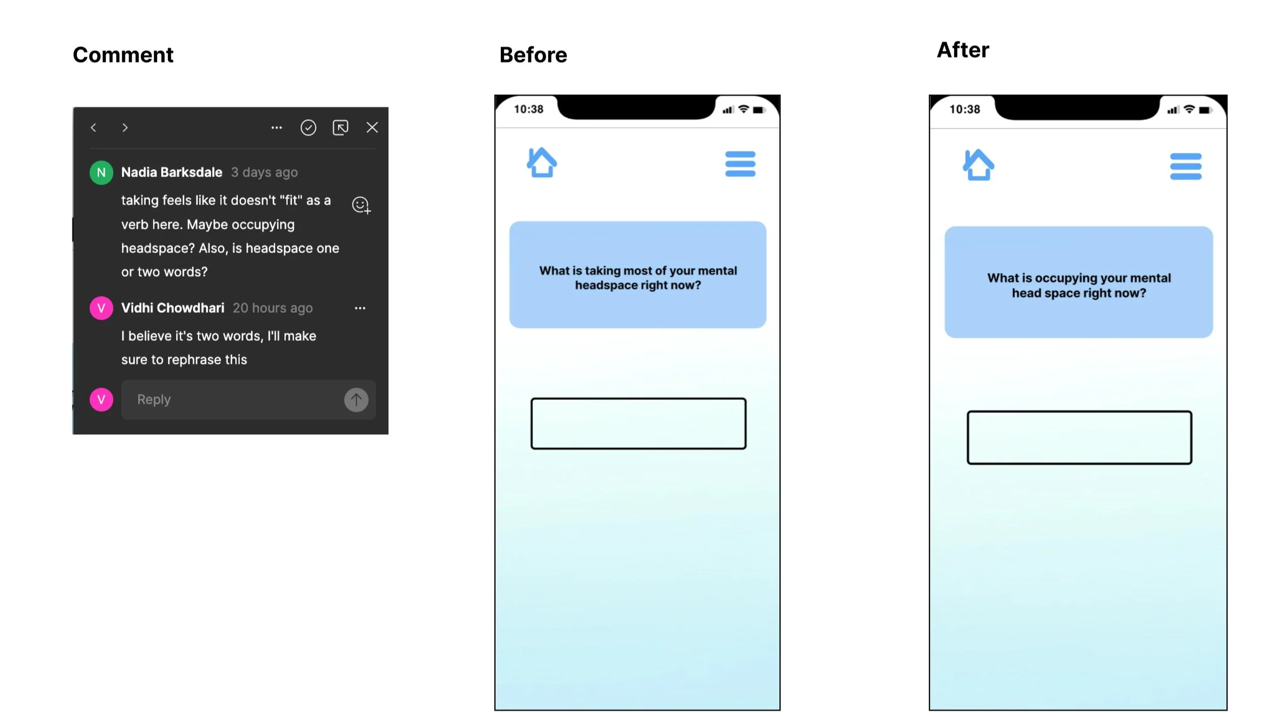
Two heads are better than one. Collaboration with others helped me gain perspective and look at the bigger picture. The collaboration allowed me to share my work and make changes based on their feedback. I was able to make tweaks to my own designs. Below are my before and after designs with the collaborator’s feedback.
Low to High Fidelity Wireframes
Style Guide / UI Elements
I was able to group design languages, rules, and protocols that govern the design and user experience of a product across multiple platforms and devices.
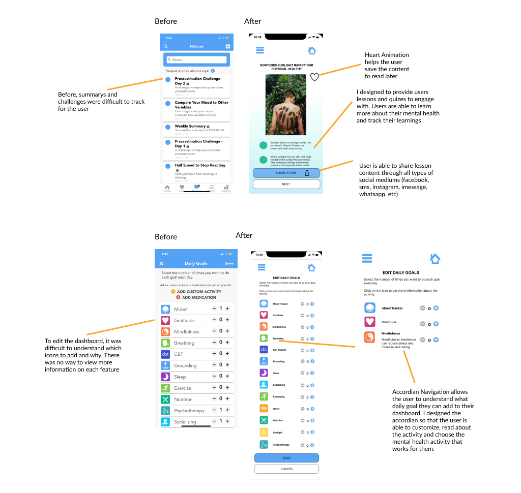
Before and After
This is the components and design functionalities before and after the redesign of the Moodfit App
Responsive Design
The Moodfit App can also be viewed on tablet and desktop, so I was able to design for three breakpoints
Learnings
A redesign is heavily dependent on user research and user feedback
User feedback has helped me tremendously when it comes to navigation and features. A redesign is not only about changing the UI elements, but it’s focused on how to create designs that are useful and more accessible to the user.
Test results and data that are drawn from different research methods are where I learned the biggest lessons on how to develop the redesigns of the Moodfit App. Conducting A/B Tests and Usability tests all resulted in simplicity and clear designs that are easy for the users to navigate.
Animation design and UI Elements can do wonders
To create an exciting experience for the user, it’s important to understand how to use different animations and UI Elements to make content more engaging for the user. You want the user to come back and become loyal to the app. One of the hardest animations I had to create was the accordion layout for the “EDIT” customization button. I wanted to be able to design the Accordian, so that the user is able to understand the different mental health activities that are offered. Once the user understands the functionality of the mental fitness activity, they can easily add it to their dashboard.


