Olive App
The Mind and Body Health App
Summary
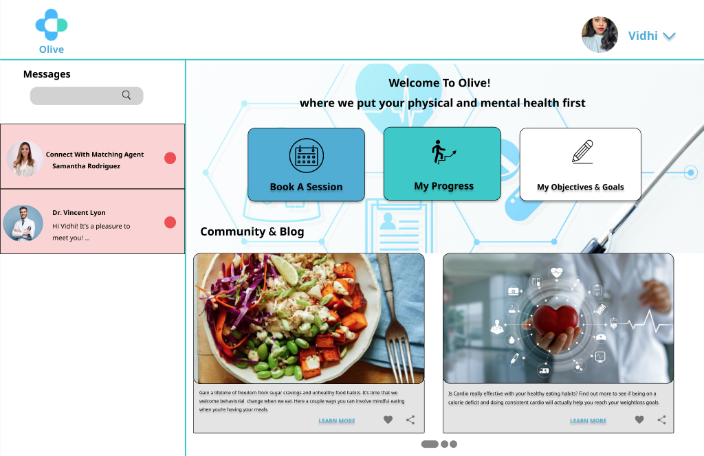
Allow health-conscious individuals to log in and access a well-being portal to record their health and medical information. Users will be able to balance their busy lifestyles by scheduling, and communicating with a responsive health professional (physical and or mental) in the comfort of their homes.
-
My Role
UX Design
UX Research
UI Design
-
Project Duration
5 months
-
Tools
Balsamiq
Figma
Marvel
Usability Hub
Optimal Workshop
Powerpoint
Challenge
The fact is that we humans are always looking to balance all facets of our life. We live very busy lifestyles, it can be incredibly difficult to balance our responsibilities and well-being. A health professional that attends to the user’s needs is not easy to find. Users are looking for help as they need assistance to accomplish their health-related goals. A user of the Olive App will need a way to access physical and mental health services. It would help them balance their busy work life and a healthy lifestyle.
I will know this to be true when I see improvement in the user’s mental and physical health by monitoring their goals and seeing how they accomplish them with their designated health professional.

Project Goals
Design for specific circumstances
Discover a problem space that digs into the complexity of balancing busy work life and a healthy lifestyle. This will allow the user to feel a sense of ease when they’re able to balance both of these aspects in their life.
Design to educate users
Not everyone knows how to change their behaviors or create healthy habits. Create a space where I can support the users on their journey toward a healthier lifestyle
Design for Inclusivity
Consider a design that caters to those with physical, psychological, and social needs. Users should feel a sense of comfort when they use our apps.
Remember Privacy
Health and medical information are very sensitive. Users’ information should be safe so they can feel reassured when using your product.
Research Methods
-
Market Research
-
Customer Interviews
-
Personas
-
Information Architecture
-
User Flows/ Customer Journeys
-
Prototype Testing
Market Research
To determine the viability of Olive App by doing research on other competitor apps similar to Olive
Key Takeaways
The Healthview and Talkspace App are similar in terms of keeping health data all in one platform. The market advantage for both apps is that they let the user customize how they would like to organize their health goals. After doing a competitive analysis on both apps, I wanted to bring the customization element into the Olive App. In the Olive App, I’ve incorporated how the Healthview App allows users to choose their physical and or mental health goals. They would be able to add the goals to the dashboard in a broad cleaner way. Also, I’ve added how the Talkspace app allows user to provide their preferences for Therapy. Olive is designed for users who would like to consult with health professionals in the industry. I needed to make sure that customization would help the user feel that they are meeting their health needs and goals.
User Depth
After conducting the customer interviews, I need to capture the customer journey and personas. This helps us identify the preferred navigation and features of the Olive App
-
It all begins with fully understanding the type of user that will be using this app. Identifying the end-user gives us information on preferred features and navigation.
-
A blueprint and bible of the Olive App, a visual representation of the app’s infrastructure and features. The blueprint includes the organization systems, labeling systems, navigation systems, and searching systems. All systems are helpful in the creation process of this app
-
Understanding the path of the user is an integral opportunity to understand how the user completes a task within the Olive App
Customer Interviews & Key Focus Areas
Interviews allow me to speak with individuals. I get a glance at how the users will interact with the Olive App every day
Key Takeaways
Many of the participants really appreciated the community aspect of the app. They really liked that they can read articles and communicate with others who have similar health goals
Participants were easily able to book an appointment/ session with their matched health professional (physician, coach, therapist, etc)
Many were unable to understand what “Rooms” meant in the first prototype, so I needed to change it to “Chat Rooms” so that the user knows that they will be chatting with someone
In my initial prototype, “Matching Agent” did not make sense to the participants, so I needed to change the verbiage to an action “Connect With a Matching Agent”
One of my participants suggested adding a field for time zone when the user is trying to book a session. I did this to make sure that the health professional and the user are aware of what time they will be connecting based on their locations
Prototype Testing
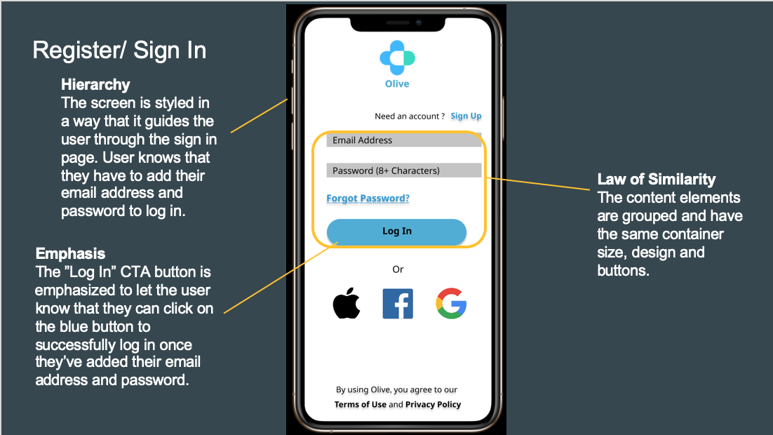
Prior to the development of the app, it’s important for me to conduct tests, identify problems and make necessary adjustments to meet the user’s wants and needs. I conducted A/B Preference Testing - Participants are presented with two different signup screens.
Design Collaboration
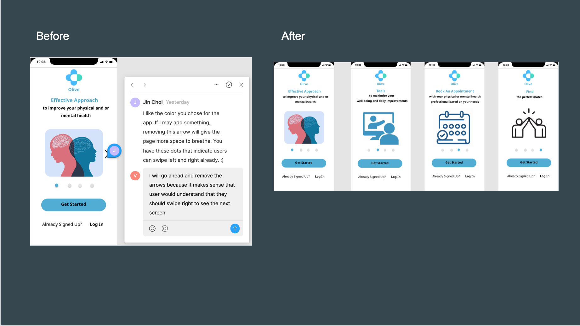
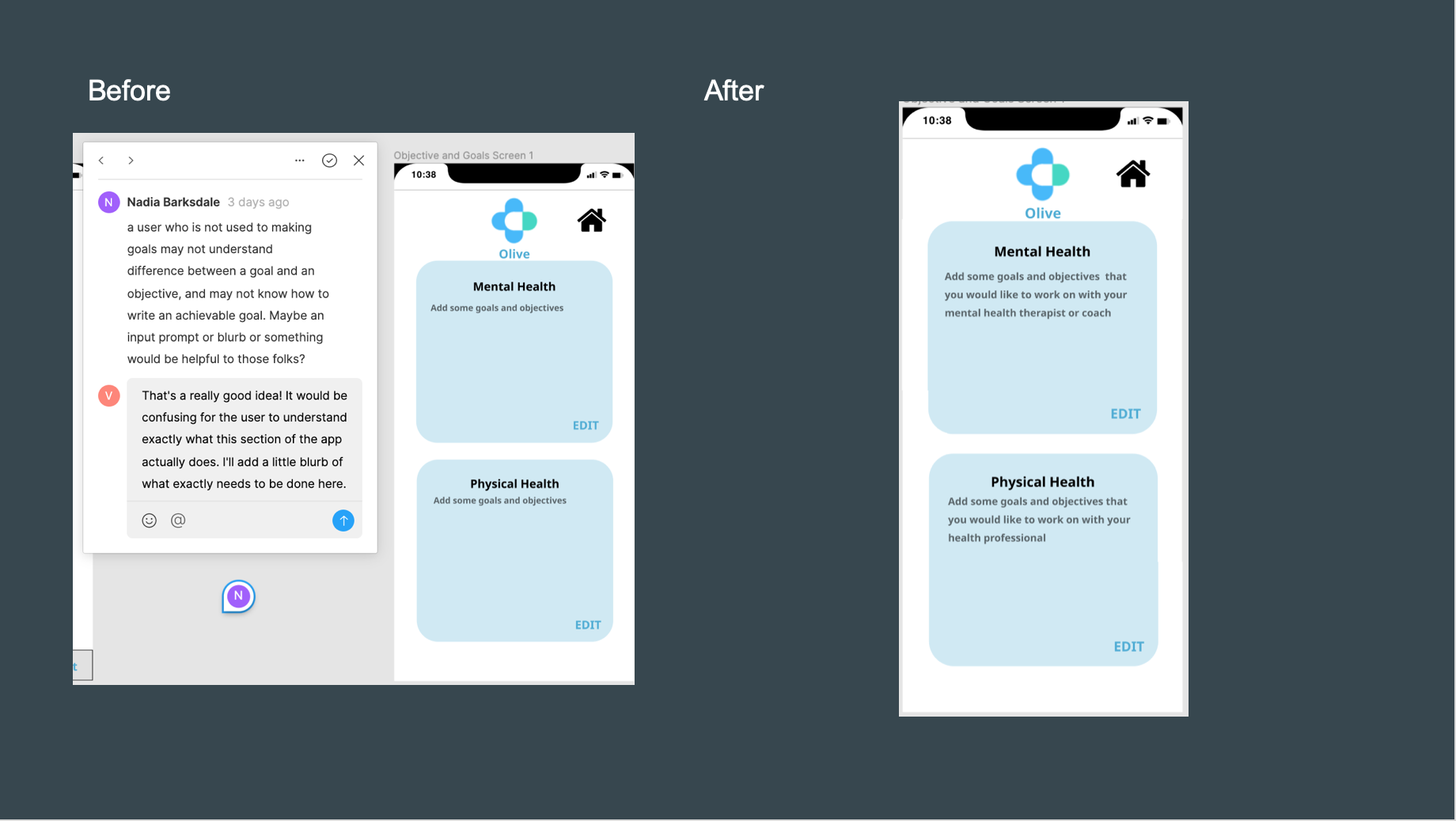
Two heads are better than one. Collaboration with others helped me gain perspective and look at the bigger picture. The collaboration allowed me to share my work and make changes based on their feedback. I was able to make tweaks to my own designs. Below are my before and after designs with the collaborator’s feedback.
Finishing Touches


Style Guide / UI Elements
I was able to group design languages, rules, and protocols that govern the design and user experience of a product across multiple platforms and devices.
Interactive Prototype
Learnings
Good research rewards us with the foundation of design strategy
One of the biggest lessons that I learned is that the designer needs to understand the user’s behavior towards the product. I should always consider doing a test to see if the user is able to interact with my product in a natural environment.
Test results and data that are drawn from different research methods are where I learned the biggest lessons on how to develop the designs of the Olive App. Conducting A/B Tests, Usability tests, and Market Research will result in simplicity and clear designs that are easy for the users to navigate.
Design Collaboration allows you to analyze your designs from a different angle
Working with multiple collaborators allows curiosity and creativity. I was able to work with many people who wanted to help improve my designs and make my navigations and processes easier. I was able to make changes that rapidly made my app easier and better to use. The process was simple, I shared my work with a team, made changes based on feedback, and repeat.
Advocate for the user while keeping the stakeholders in mind
It’s highly important to keep users’ preferences and business needs in mind when creating designs. Key stakeholders can provide insightful industry information. The more the stakeholders are involved, the more I will reduce and uncover the risks of my project.


